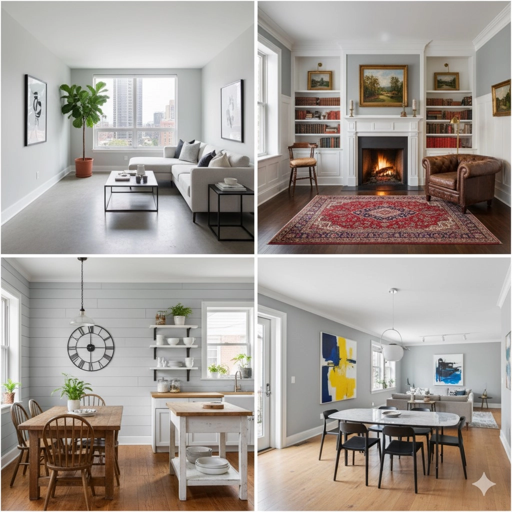
Choosing the right paint color can be overwhelming. With so many grays on the market, it’s easy to feel lost. One shade that homeowners and designers keep recommending is Benjamin Moore Boothbay Gray (HC-165).
This soft and versatile color has gained popularity for its ability to work well in many different rooms and lighting conditions. In this article, we’ll cover everything you need to know about Boothbay Gray in simple, easy-to-understand language. By the end, you’ll know if this color is the right choice for your home.
What Makes Boothbay Gray Special?
Boothbay Gray is part of Benjamin Moore’s Historic Color collection. At first glance, it looks like a soft gray. But as soon as you put it on the wall, you’ll notice it has subtle blue and green undertones.
This is what makes it so versatile. It’s not just a flat gray—it shifts in different lights and adds personality to your space without being too bold.
Think of it as a “chameleon gray.” Some people see more blue in it, while others notice a gentle green touch, depending on the time of day and lighting in the room.

How Boothbay Gray Looks in Different Lighting
Lighting plays a huge role in how this color appears. Here’s what you can expect:
- Morning Light: Cooler tones come out, and you’ll notice a fresh coastal vibe.
- Afternoon Sun: The gray feels warmer and more balanced with soft green undertones.
- Evening Light: The color deepens into a more neutral gray, less blue or green.
- Artificial Light: Warm bulbs make it cozier, while cool LED lights bring out the blue side.
This is why it’s always smart to test a sample in your home before committing to a full paint job.
Boothbay Gray Color Details
- Color Code: HC-165
- Hex Code: #ABB2AF
- Light Reflective Value (LRV): 43.26
- RGB Values: (171, 178, 175)
In simple terms, this means Boothbay Gray reflects a medium amount of light. It won’t make your space feel too dark, but it’s not the brightest gray either. It sits comfortably in the middle, making it suitable for both small and large rooms.

Why Homeowners Love Boothbay Gray
Boothbay Gray is a favorite because it feels timeless and adaptable. It works in both modern homes and traditional settings. Here’s why people keep choosing it:
- Neutral yet interesting: It’s gray with a touch of color, so it doesn’t feel flat.
- Pairs with many styles: From rustic wood tones to sleek modern furniture, it blends well.
- Relaxing atmosphere: Its soft undertones bring calmness, perfect for bedrooms and living spaces.
- Durability: Like other Benjamin Moore paints, it’s long-lasting and resists fading.
Best Rooms for Boothbay Gray
Living Room
Boothbay Gray creates a cozy yet open feeling. It pairs beautifully with white trim, wood accents, and navy furniture. Under natural light, the room feels fresh and airy.
Kitchen
This shade gives kitchens a clean and inviting look. It looks amazing with white or navy cabinets, stainless steel appliances, and stone countertops.
Bedroom
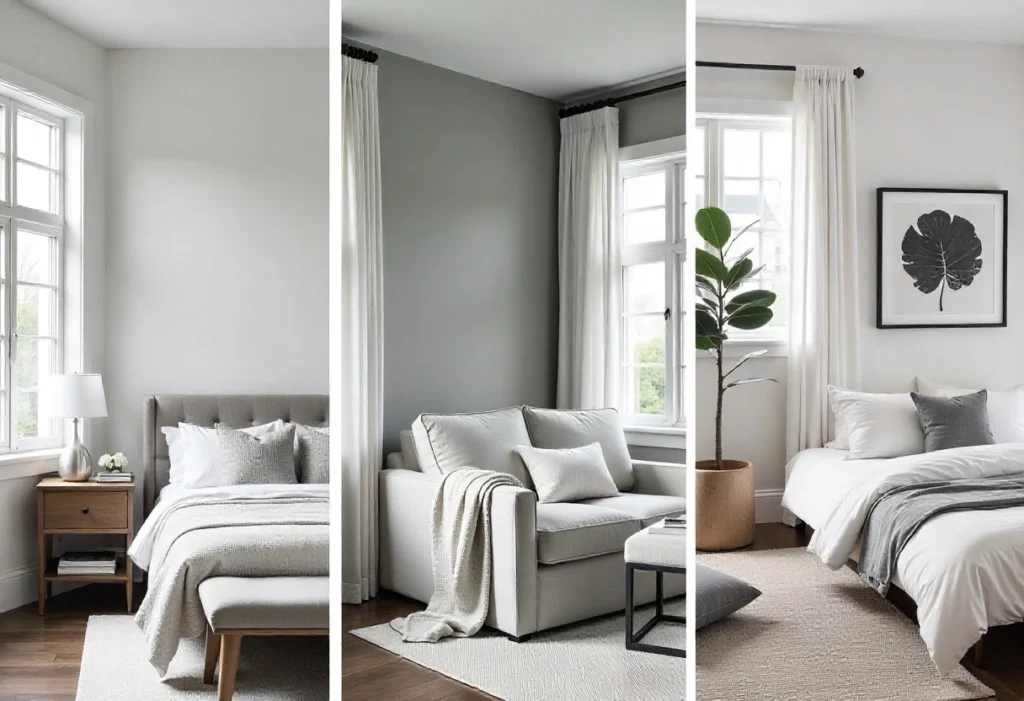
If you want a peaceful retreat, this is a great choice. Its subtle blue undertones promote relaxation and sleep. Pair it with soft bedding in white, beige, or muted pastels for a calming vibe.
Bathroom
For a spa-like feel, Boothbay Gray works perfectly. It complements white tiles, chrome fixtures, and marble countertops, keeping the space bright and fresh.
Dining Room
It adds elegance without being overpowering. Works well with both modern and traditional dining sets, and looks great under warm lighting.
Home Office
Unlike stark white, Boothbay Gray provides a balanced background that helps you stay focused. It also looks professional on video calls, which is a bonus for remote workers.
Colors That Pair Well with Boothbay Gray
If you’re planning a color scheme, here are some tried-and-true pairings:
- White Wisp (OC-54): A soft off-white, perfect for trim and ceilings.
- Chantilly Lace (OC-65): Crisp white for doors and moldings.
- Stonington Gray (HC-170): Another gray that adds depth when used in nearby rooms.
- Frosted Petal (2089-70): A muted pink for accents and décor.
These colors keep your space looking fresh, balanced, and cohesive.
Similar Colors to Boothbay Gray
Not sure if Boothbay Gray is the perfect match? Here are some alternatives:
- Silver Mink (1586): A slightly warmer gray.
- Marina Gray (1599): Cooler with stronger blue undertones.
- Mount Saint Anne (1565): Deeper gray with a moody, dramatic feel.
- Iced Marble (1578): Lighter gray with a greenish touch.
Boothbay Gray and Home Materials
This color also pairs beautifully with different textures:
- Wood: Natural oak or walnut adds warmth.
- Metal: Matte black or brushed nickel enhance modern style.
- Stone: Marble, quartz, or slate highlight its neutrality.
- Fabrics: Linen and velvet soften the look.
- Brick: Works well with both painted and exposed brick.
Tips Before Choosing Boothbay Gray
- Test it first – Paint a sample on your wall and check it morning, afternoon, and evening.
- Check undertones – Make sure it doesn’t clash with your furniture or flooring.
- Pick the right finish – Matte for walls, satin for trim, and semi-gloss for cabinets.
- Compare with nearby colors – Especially in open-concept homes.
- Think about lighting – If your room doesn’t get much natural light, pair it with bright whites to avoid dullness.
Common Mistakes to Avoid
- Using it in very dark rooms without enough light.
- Pairing it with clashing undertones like strong yellows or greens.
- Forgetting to test with your décor and flooring.
- Choosing the wrong paint sheen for the space.
Final Thoughts
Benjamin Moore Boothbay Gray (HC-165) is a versatile, calming, and timeless gray that adapts beautifully to different spaces. Its mix of gray with subtle blue-green undertones makes it more interesting than plain grays, without being overwhelming.
Whether you want a soothing bedroom, a fresh kitchen, or a balanced home office, Boothbay Gray can deliver. Just remember to test it in your own lighting conditions before painting the entire room.
If you’re looking for a gray that feels stylish, relaxing, and easy to pair with other colors, Boothbay Gray is a smart choice that will stand the test of time.
