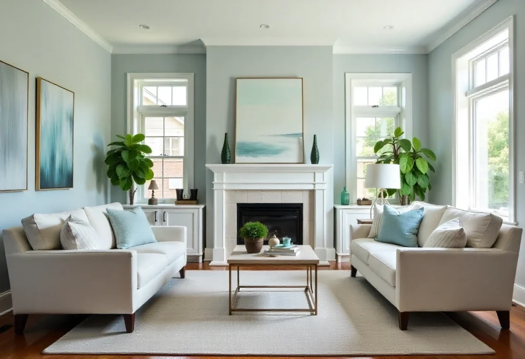
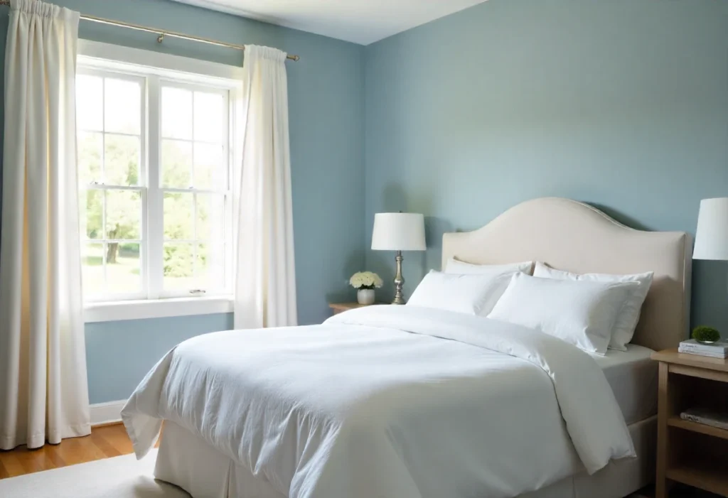
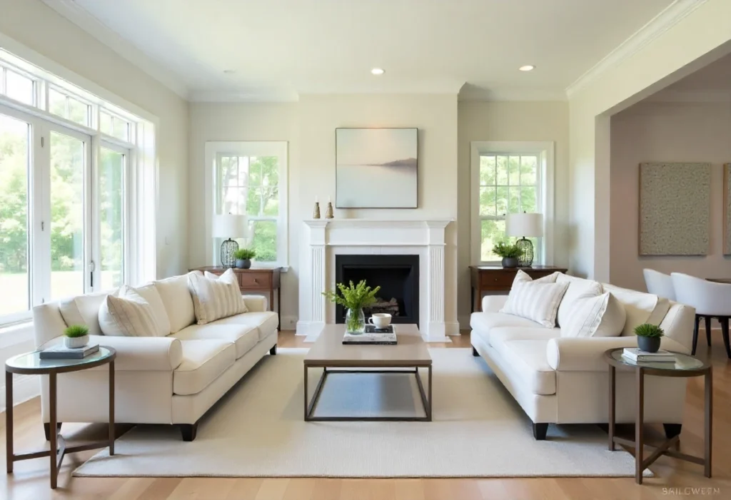
If you’re searching for a paint color that feels calm, fresh, and timeless, Sherwin Williams Upward (SW 6239) might be the one.
It’s a soft blue shade with a touch of gray that makes any room feel peaceful. Whether you want your home to look cozy or modern, Upward fits in perfectly.
In this article, we’ll look at:
- What makes this color special
- The best rooms to use it in
- Color pairings that look amazing with it
- Real tips from painting experts
Let’s dive into the world of Sherwin Williams Upward and see why so many homeowners and designers love it.

What Makes Sherwin Williams Upward Special?

1. A Soft and Relaxing Blue
Upward is not just any blue. It’s light, airy, and has a small hint of gray.
This balance makes it soothing to the eyes. It’s like looking at a clear morning sky — soft, gentle, and relaxing.
Unlike brighter blues, it doesn’t feel too cold or too bold. Instead, it adds a peaceful feeling to your room.
2. Works With Any Style
One of the best things about Upward is its versatility.
It looks great in:
- Modern homes: pairs beautifully with black, white, and gray décor
- Coastal spaces: complements sandy tones and driftwood accents
- Farmhouse interiors: blends well with warm wood beams and white trim
No matter your style, this color adapts easily.
3. Beautiful in All Lighting
Upward changes slightly with the light, which makes it interesting.
- In morning light, it feels like a soft sky blue.
- In daylight, it turns into a balanced neutral blue.
- In evening light, it becomes warm and cozy.
This gentle shift adds personality to your walls without being too strong.
Where to Use Sherwin Williams Upward

1. Bedrooms and Bathrooms
Upward is perfect for bedrooms because it feels calm and restful.
Paint your walls with it, and your space will feel like a cozy cloud.
In bathrooms, it creates a clean, spa-like look. Pair it with white tiles, silver fixtures, and soft towels for a peaceful retreat.
2. Living Rooms and Common Areas
This color works wonders in open spaces. It makes large areas feel light and spacious but still warm and inviting.
If you have artwork or colorful furniture, Upward helps those pieces stand out beautifully.
Pro Tip:
Use white trim with Upward for a fresh, balanced look.
3. Exteriors and Front Doors
Upward is also stunning on exteriors. It’s soft enough to blend into the neighborhood but still eye-catching.
Paint your front door or porch with Upward, and it will give your home a welcoming, cheerful feel.
Against white trim or gray siding, it looks clean, stylish, and timeless.
Best Color Pairings for Upward
To make Upward shine, try these perfect pairings:
| Type | Color Name (SW Code) | How It Looks |
|---|---|---|
| Trim | Pure White (SW 7005) | Bright, clean contrast |
| Accent | Naval (SW 6244) | Deep navy for a bold statement |
| Neutral | Agreeable Gray (SW 7029) | Warm gray that balances blue tones |
| Soft Pairing | Sea Salt (SW 6204) | Light green-gray for coastal calm |
| Complementary | Rainwashed (SW 6211) | Adds gentle color variation |
Finish Tips:
- Living Rooms: Eggshell finish adds soft shine
- Bathrooms: Satin finish resists moisture
- Trim or Doors: Semi-gloss for clean contrast
What Colors and Materials Match Well
Upward looks amazing with different materials:
- Wood Floors: Light oak or gray-washed wood
- Countertops: White or marble surfaces
- Hardware: Brushed nickel, matte black, or bronze
- Fabrics: White cotton, navy velvet, or beige linen
Upward vs Other Blue-Gray Paints
Many people compare Upward to other popular blues like Misty (SW 6232) or Benjamin Moore Horizon (OC-53).
Here’s how they differ:
| Color | Tone | Feeling |
|---|---|---|
| Upward (SW 6239) | Balanced blue-gray | Calm, adaptable |
| Misty (SW 6232) | More gray than blue | Cooler, more neutral |
| Horizon (OC-53) | Softer gray-blue | Slightly colder tone |
Why Upward Wins:
It has just the right mix of blue and gray — not too cold, not too bright. It feels friendly, balanced, and timeless.
Real Feedback from Homeowners
Many homeowners and designers love Upward because of how it changes a room’s mood.
💬 “My home office feels peaceful and bright now — like a sunny morning every day.”
💬 “I painted my small bathroom with Upward, and it actually looks bigger and fresher.”
💬 “It’s soft but never boring. Everyone compliments the color when they visit.”
These reviews show how Upward not only looks beautiful but also creates emotion — comfort, calm, and positivity.
Possible Challenges (and Solutions)
Even great colors have small challenges:
- Lighting Sensitivity:
It can look lighter or darker depending on your light. Always test a small area first. - Coverage:
Two coats are usually needed for the best finish. - Matching with Wood:
Test it against dark wood tones to make sure it balances well — usually, it does!
🛠️ Pro Tip: Always look at the color sample at different times of day before painting the whole wall.
Conclusion
Sherwin Williams Upward (SW 6239) is one of those rare paint colors that fit everywhere.
It’s calm yet full of character — perfect for bedrooms, bathrooms, and even exteriors. With its gentle blue-gray tone, Upward brings peace, beauty, and balance to your home.
If you’re searching for a timeless color that never feels boring, Upward is a safe and stylish choice.
Frequently Asked Questions
Q1. Is Upward too blue for an entire house?
No. It’s a balanced blue-gray that works across different rooms and lighting conditions.
Q2. Does it make small rooms look smaller?
Not at all! Its light tone actually makes small spaces look more open and airy.
Q3. What trim color goes best with Upward?
Pure White (SW 7005) is perfect for clean contrast.
Q4. Is Upward good for exteriors?
Yes, it’s beautiful outside too. It gives homes a soft, welcoming look.
Q5. What is the light reflectance value (LRV) of Upward?
The LRV is 57, meaning it reflects a good amount of light and keeps rooms bright.
