

Planning a full remodel? Or just want a fresh coat of paint that stays good-looking for years? Either way, the color you pick for your cabinets sets the tone for the whole room. Cabinets take up more visual space than almost anything else in a kitchen.
This guide covers the best timeless kitchen cabinet colors, with specific paint names, pairing ideas, and practical advice from interior designers. You’ll also learn how to hide stains, match paint to wood, and test samples the right way.
Why Timeless Kitchen Cabinet Colors Matter
Paint trends move fast. A shade that looks fresh today can feel dated in three years. That’s a problem, because cabinets are one of the most expensive and time-consuming parts of a kitchen to change.
Repainting is possible, but it’s not quick. A smooth, durable finish needs cleaning, sanding, priming, and at least two coats, with light sanding between each one. Many homeowners spend a full week on it. Professional cabinet painting often costs several thousand dollars.
So it pays to choose well the first time. Ask yourself one question before you buy paint: will this color still make sense for my home in 10 years?
Match the Color to Your Home
Portland designer Stephanie Dyer, who has a background in historic preservation, suggests starting with the house itself. Look at its age, architecture, and layout. Then choose colors that fit that style instead of forcing in a look that doesn’t belong.
A 1920s Craftsman bungalow suits muted greens and warm woods. A coastal cottage suits soft blues and whites. A colonial home suits deeper, traditional tones. When the color matches the structure, it looks planned rather than trendy.
Classic Cabinet Colors That Rarely Go Out of Style
1. Black and White
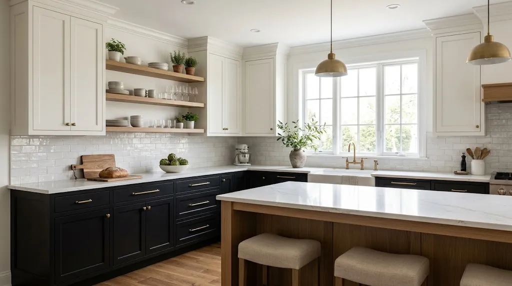
Black is one of the safest long-term choices. It works in both traditional and modern kitchens, but you need to use it with care. An all-black kitchen can feel heavy, especially in a small room.
The fix is a two-tone layout. Paint the base cabinets in black or another deep, rich shade. Then use white or a pale color on the upper cabinets. The dark lower half adds weight to the room, while the light upper half keeps it open.
This split also helps small kitchens with low ceilings. The pale uppers draw the eye up, so the room feels taller.
Pairing tip: Dark cabinets look best with light countertops. A white quartz or pale stone surface reflects light back into the room and adds contrast. Choose a matte or satin black finish to reduce fingerprints.
2. French Blue
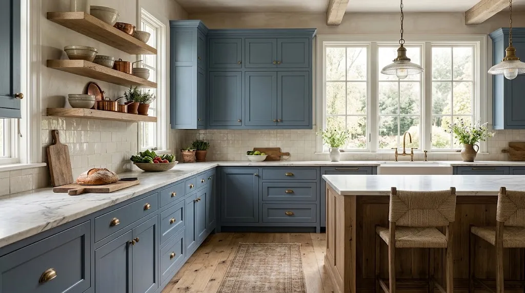
French blue is a medium blue with soft gray or green undertones. It has long been linked to French country style. It feels warm, calm, and a little elegant.
Sherwin-Williams Delft is a well-known example. It takes its name from Dutch Delftware pottery, which has been made since the 1600s. Designer Tiffany Skilling points to that long history as a reason the color holds up.
French blue works well with brass hardware, white countertops, and natural wood open shelving. It’s a good fit for cozy kitchens, farmhouse spaces, and cottages.
3. Soft, Muted Greens
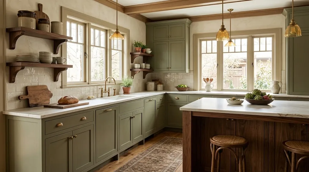
Green cabinets are very popular right now. The right shade can look like it came with an older Craftsman or cabin-style home. The range is wide, though, so you need to be selective.
Bright shades like Kelly green get attention fast. They also tire the eye fast. Ask yourself if you want to see that color every morning for the next decade.
Muted shades are safer. Sage, jade, and olive are easy to live with. For a darker option, look at Sherwin-Williams Rosemary. Skilling notes that a soft, quiet green feels soothing and doesn’t crowd the room.
Pairing tip: Green works well with wood tones, white or cream walls, and aged brass or bronze hardware.
4. Earth Tones
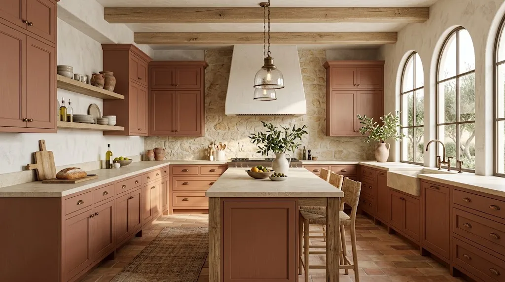
Colors with depth tend to age better than pure primary colors. Dyer explains that complex shades hold interest longer than simple, bright ones. In practice, that means picking terracotta or ochre over a sharp lemon yellow or bright orange.
Earth tones suit Southwestern, Spanish, and Mediterranean homes especially well. They also look good in modern kitchens with natural materials like stone, clay, and linen.
If you choose an earthy cabinet color, build the rest of the room around it. Pick a backsplash, wall color, and accessories in the same color family. A soft greenish-gray cabinet with matching crackle-glaze tile and a close wall color is one example. A single tonal range like this keeps the room calm and ties everything together.
5. Eggplant
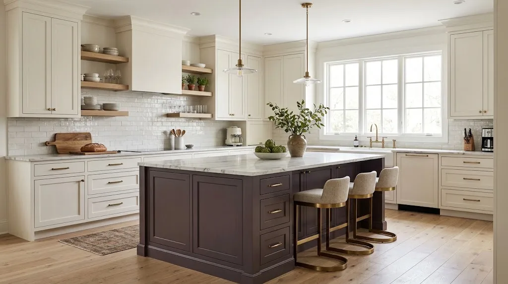
Eggplant is a deep purple with brown and gray in it. That mix gives it a rich, moody look that still feels refined. It works in both modern and traditional kitchens.
Dyer used eggplant in a modern home, but not with paint. She chose plastic laminate, which resists stains and wear. That’s a smart option if you cook often or have kids, since laminate handles daily abuse better than many painted finishes.
Use eggplant on a kitchen island or lower cabinets if a full wall of it feels like too much.
6. Burgundy and Wine Tones
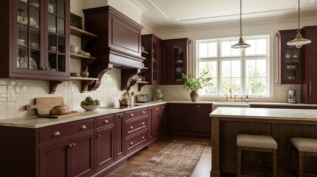
Burgundy sounds risky, but it has a long history in traditional design. Skilling chose it for her own kitchen after spotting the same tone in an antique wall covering in her dining room.
That’s a useful trick. Look at older materials in your home or in historic homes from the same era. Old wallpaper, textiles, tile, and fabric all show which colors lasted. If a color has been used for generations, it’s less likely to look dated soon.
Burgundy suits colonial, Victorian, and other traditional houses. A semi-gloss finish adds durability and is easier to wipe clean.
7. Off-White (Instead of Bright White)
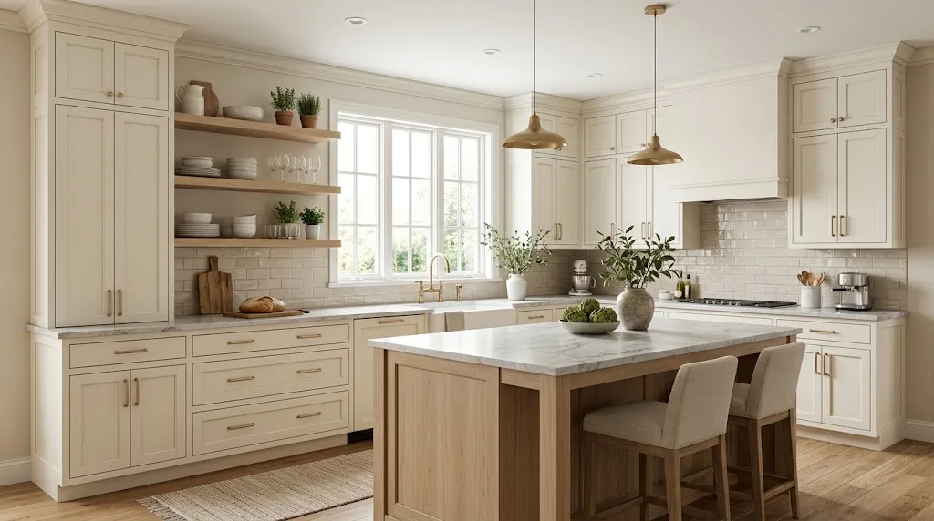
Bright white is classic and still popular. But Charleston designer Christyn Dunning-Gauss prefers softer shades. She says bright white can feel cold and flat, and it shows every spot and smudge.
Off-white has a bit of warmth. It feels friendlier and works with almost any countertop, hardware finish, or tile. Two popular choices are:
- Sherwin-Williams Alabaster
- Benjamin Moore White Dove
Always test off-whites in your own light. Cream undertones can look yellow in warm lighting and gray in cool lighting.
8. Tan and Light Taupe
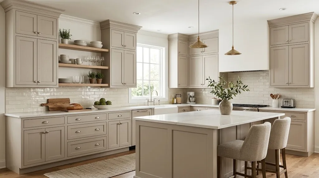
Subdued neutrals give a kitchen a calm, finished look. Dunning-Gauss often uses tan and light taupe for that reason. Good options include Sherwin-Williams City Loft and Benjamin Moore Natural Cream.
These shades pair easily with other colors, so you can change accents later without repainting. Swap the stools, add a new runner, or update the backsplash. The cabinets will still look right.
If you want a brighter result, ask the paint store to mix the color at about 50 percent strength. That lightens it without changing the undertone.
9. Blue and White
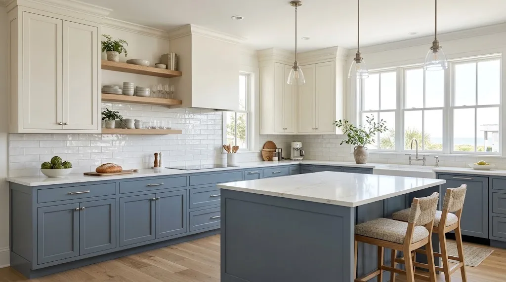
Many clients ask for a kitchen that feels crisp and clean. Dyer often suggests white paired with a cool blue, such as Benjamin Moore Providence. It’s a slate blue with dark gray undertones, so it looks quiet and polished.
This combination works in many settings. It’s especially popular in beach houses and coastal homes, where it gives a light, breezy feel. Use the blue on the base cabinets or island and white on the uppers.
How to Choose the Right Cabinet Color: 3 Practical Factors
Which Colors Hide Stains Best?
Kitchens get messy. Splashes, grease, and fingerprints show up fast, especially in homes with several cooks or young children.
Stained wood hides spills better than paint. If you prefer paint, go darker. Smoky blue and pewter gray tend to hide marks well. Avoid ultra-bright white. It shows nearly everything.
Finish matters too. High-gloss shows fingerprints. Satin and semi-gloss are easier to wipe clean and hold up better to repeated washing.
What Colors Work Well With Wood?
Wood is a classic kitchen material. You might have wood floors, a butcher block counter, open shelves, or a built-in hutch. Paint should complement these pieces, not clash with them.
Wood species and stain affect the result:
- Walnut: Deep colors look great next to it, including black, navy, and dark green.
- White oak: Avoid shades with yellow undertones. That includes yellow, orange, and most reds.
- Cherry and mahogany: Cool, muted colors like gray-blue or soft green balance the red tones.
A popular layout is wood upper cabinets with painted lower cabinets. It adds contrast and keeps the room from feeling flat.
If you plan to paint wood cabinets, the material underneath matters for durability. Birch is often recommended because it has a smooth, tight surface that takes paint well and resists dents and wear.
How to Test Paint Colors the Right Way
Small paint chips and online photos can mislead you. Color changes with light, and your kitchen’s light changes throughout the day.
Follow these steps:
- Buy a sample-size can of each finalist color.
- Paint a large patch on a cabinet door or a board, at least two feet square.
- Check it in the morning, at midday, and at night with your lights on.
- Look at it next to your countertop, floor, and backsplash.
- Leave it up for several days before deciding.
Peel-and-stick samples are an easier option. Samplize offers real paint samples from Benjamin Moore, Farrow & Ball, PPG, and Sherwin-Williams. You can move them around the room without painting anything. Skilling recommends them for this reason.
Quick Tips for Painting Cabinets
If you choose to paint the cabinets yourself, preparation decides how the finish turns out.
- Remove doors, drawers, and hardware, and label each piece.
- Clean every surface with a degreaser. Kitchen grease blocks paint from sticking.
- Sand lightly, then wipe off the dust.
- Apply a bonding primer.
- Use a cabinet-grade enamel paint in satin or semi-gloss.
- Sand lightly between coats and allow full drying time.
Rushing any of these steps leads to peeling and brush marks. Many painters let doors cure for a week or more before reinstalling them.
Final Thoughts
The best timeless kitchen cabinet colors share a few traits. They have depth, they suit the home’s style, and they work with natural materials. Soft off-whites, muted greens, French blue, earth tones, and deep classics like black and burgundy all meet those standards.
Before you commit, look at your home’s architecture, test samples in your own light, and pick a finish that fits how you cook. If you love the color after a week of looking at it, that’s a strong sign it will last.